Friday, 16 January 2015
Thursday, 15 January 2015
Wednesday, 14 January 2015
Draft Plot for Film Review
I typed up the plot of the short film so it could be added to the film review:
A heart-breaking British drama about 17 year old, Nathan caught up in an adverse situation within his local area. Forcing his mistakes upon his younger brother leads to misfortune within the family.
Film Poster Editing 3
I was able to add the star ratings and logos of production companies. I played around with colouring so it wasn't so plain and I decided to put it on the release date. I choose to use a dark red as a bright colour wouldn't fit the theme.
Tuesday, 13 January 2015
Film Poster Editing 2
Because of the chosen colour scheme it would be hard to have the text show up on the image, because of this we have chosen to use a banner across the bottom of our poster. Only one of the case studies looked at had a banner which was for Shank. I have been able to find other film posters that use banners and luckily for us it works too.
Monday, 12 January 2015
Film Poster Editing 1
Here is chose the release date and the positioning for the title and the release date. However I think I may have to change around things when I added the image. I got the text from Adobe Illustrator and copied and pasted it onto Adobe Photoshop. On Adobe Photoshop I was able to resize it.
I began to add the billing box which included the production, actors, people who filmed, edited, sound and music by. I got my inspiration from looking at 'Inception' film poster.
Once I finished the billing box I was able to put it all together and line it up equally, I then put it under the title as it positioning.
After that I added the quotes of the film which was worded by Zaneb.
I need to now add the star ratings and the image.
Saturday, 10 January 2015
Choices for Film Poster
These are the four photographs are the options:
I feel like Nathan's facial expression captures the essences of the film and he background has the flats relates to the urban film.
I like this one because of the focus of lense, it is a clear shot. I think his shoes are too bright for this shot.
I like this shot but I think looking directly into the lense would be better.
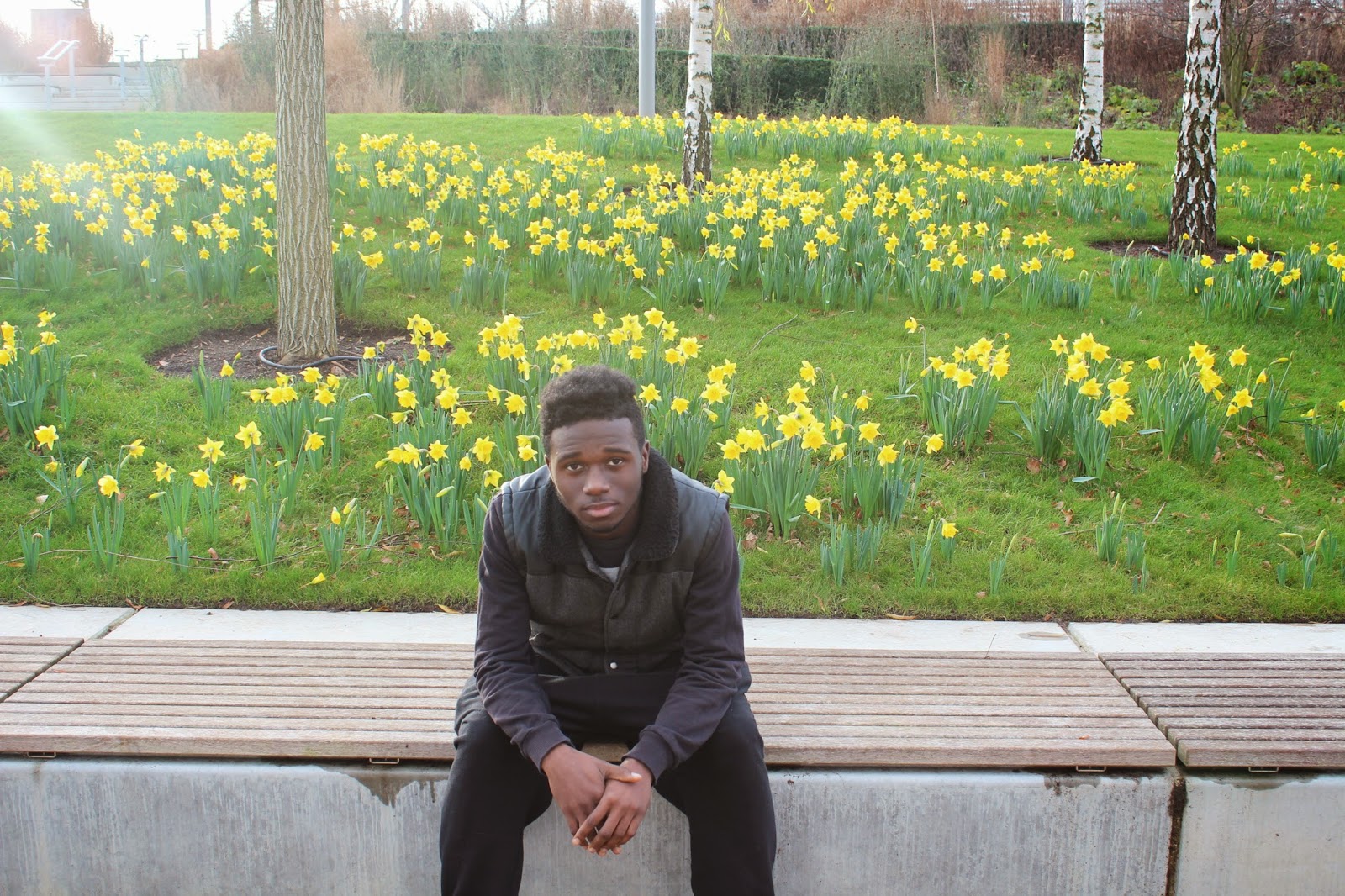
I like the flowers in the background but they're not the flowers in the film so they have no relevance.
Subscribe to:
Comments (Atom)


